


|
|

Change the appearance or content of a hierarchy chart
This topic describes the ways you can customize a tree map or sunburst chart to suit your analytical approach. Hierarchy charts are available in NVivo for Mac (Version 11.2 or later).
What do you want to do?
- Change what the areas are sized by
- Change what the areas are colored by
- Change the colors displayed on a hierarchy chart
- Change the data in a hierarchy chart of nodes or sources
- Change the number of levels displayed on a hierarchy chart
- Change the order of attributes displayed on a hierarchy chart
Change what the areas are sized by
If your hierarchy chart displays coding for nodes or sources, you can change what the areas are sized by.
-
In the panel to the right of the hierarchy chart, under Size by, click one of the following:
| Option | Action | Applies to |
| Coding References | Size the areas by the number of coding references. A larger area indicates more coding references. | Coding for Nodes
Coding for Sources |
| Items Coded | Size the areas by the number of sources coded by the node. A larger area indicates more items coded. | Coding for Nodes |
|
Nodes Coding |
Size the areas by the number of nodes coding the source. A larger area indicates that more nodes code the source. |
Coding for Sources |

Change what the areas are colored by
-
In the panel to the right of the hierarchy chart, under Color by, click one of the following:
| Option | Action | Applies to |
| Hierarchy | The density of the color represents the level of the hierarchy. The highest level has the darkest shade of the color and each lower level in the hierarchy has a lighter shade of the same color. |
Coding for nodes Attribute values for cases Attribute values for sources |
| Coding References | Color the areas by the number of coding references. A darker color indicates more coding references. | Coding for sources |
| Items Coded | Color the areas by the number of items coded by the node. A darker color indicates more sources coded. | Coding for nodes |
| Nodes Coding | Color the areas by the number of nodes coding the source. A darker color indicates more nodes code the source. | Coding for sources |
| None | Remove color from the chart. All areas display white. | All |
| Automatic | The color shading has no significance. | Coding for sources |
| Show Item Color | Display item colors in the chart.
|
All |
Change the colors displayed on a hierarchy chart
-
In the panel to the right of the hierarchy chart, under Color scheme, click one of the color options in the gallery.
Change the data in a hierarchy chart of nodes or sources
In the panel above the hierarchy chart, change the items you want to include in the chart.
-
Compare Select what you want to display in the areas of the hierarchy chart. If you choose a large number of nodes or cases, you will see a large number of rectangles in the tree map, or segments in the sunburst chart.
-
Coded at You can change this to focus on particular items of interest.
NOTE If the panel above the hierarchy chart is not visible, you can re-display it—click the disclosure triangle next to Visualize.
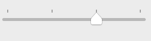
Change the number of levels displayed on a hierarchy chart
If your hierarchy chart displays nested levels of nodes or attribute values, you can choose the number of levels to display.
-
Under View level, adjust the slider to display your preferred number of levels
Change the order of attributes displayed on a hierarchy chart
The order of the attributes in the box on the right determines the nesting of the areas in the hierarchy chart. You can change the order of attributes that are displayed on a hierarchy chart that compares attribute value combinations—this can give you a new perspective on the range of sources or cases in your project.
-
In the panel above the hierarchy chart use the up arrow or the down arrow to change the order of the selected attributes.